Yellowcard

Two million people had signed up for Yellow Card. Most of them were sitting still.
Try the prototypethe defining interaction: the customer does the thing the card asked, and the card moves on. the balance changes, the sentence changes, everything else stays where it was.
What was wrong. Yellow Card is Africa’s largest regulated crypto exchange, in more than twenty countries. Acquisition worked. Activation did not: accounts without a deposit, deposits without a trade, one trade and then silence. 85% of customers had never finished verification.
Why it mattered. How do you put useful guidance inside a financial product without turning the home screen into advertising, and without making anyone learn before they are allowed to act? The card is the whole answer to that, and it shipped in the consumer app in 2023.
What I designed. Not a tutorial and not a checklist page: one home screen that reads where a customer is and shows one next move. One card at the top of the screen everyone already lands on, with a sentence that changes as the customer does.
What it looked like. The home screen, the first launch, quick insights, and the two directions we did not ship, all of them below and all of them working. At the end you can be each of the three customers.
- role
- product designer. I owned the nudge system end to end: research synthesis, prioritisation, the home-screen architecture, the three states, quick insights and the copy.
- team
- a lean consumer product team: one product manager, one iOS and one Android engineer, one backend engineer, a content writer, and me on design. The idea started at an internal hackathon.
- status
- shipped in the consumer app in 2023 on iOS and Android.
the problem, scope, timeline and signals
- problem
- two million registered customers, most of them inactive. move them from signed up to deposited to trading, without a campaign.
- scope
- research synthesis · effort/value prioritisation · home-screen architecture · the stage-aware nudge slot · first-launch steps and walkthrough · quick insights and articles · every line of copy.
- timeline
- about fourteen weeks from the hackathon to release, in the first half of 2023: two weeks of research synthesis and prioritisation, six of design and copy rounds, the rest in build and a staged rollout.
- signals
- deposit conversion 44% · buy conversion 82% · KYC completion 30%, among previously inactive customers. real movement; what each number can and cannot say is defined below.
acquisition was solved. activation was broken.
The product worked. People could deposit, buy, sell and withdraw across twenty markets. They just weren’t doing it. 85% had not finished KYC. Most had never made a first trade. In the funnel we used, acquisition was handled and activation was where everyone fell out.
We asked them. Of 114 survey responses, only 14% called themselves crypto pros. Nearly half said they had a lot to learn but found it exciting. A quarter were financially literate but still working crypto out. One in eight had no idea what they were doing. Almost nobody said the app was hard to use.
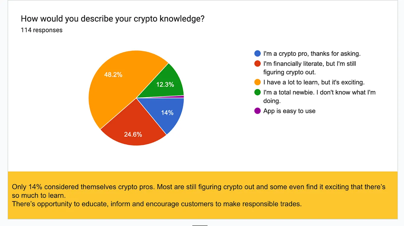
That reframed the job. Crypto has a language problem: wallets, gas, KYC, stablecoins, none of it maps to anything a first-time customer already knows. We had been dropping people into a trading desk and expecting them to find their own way. Every inactive account was a question the product had not answered.
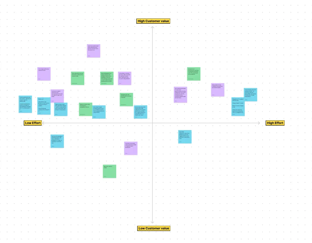
The research produced a long list of possible fixes. We ran an effort-against-customer-value session to cut it down. Everything that survived was about the same thing: tell the customer what to do next, at the moment they need it, one thing at a time.
the fix had to live where people already were
The obvious places for guidance are a tutorial at sign-up or a checklist somewhere in the app. Both put the help where the customer is not. The people we were losing had already been through onboarding and had already left the checklist behind. The one screen they reliably returned to was the home screen, and then they left it.
a tutorial at sign-up
shown once, to everyone, before they know what they need. gone by the time a customer is stuck at step two.
a getting-started page
a checklist behind a tab. it works for people who go looking for it, which is not the people who were inactive.
the home screen itself
the one screen every customer lands on. read where they are, show the one thing that matters to them now, and get out of the way.
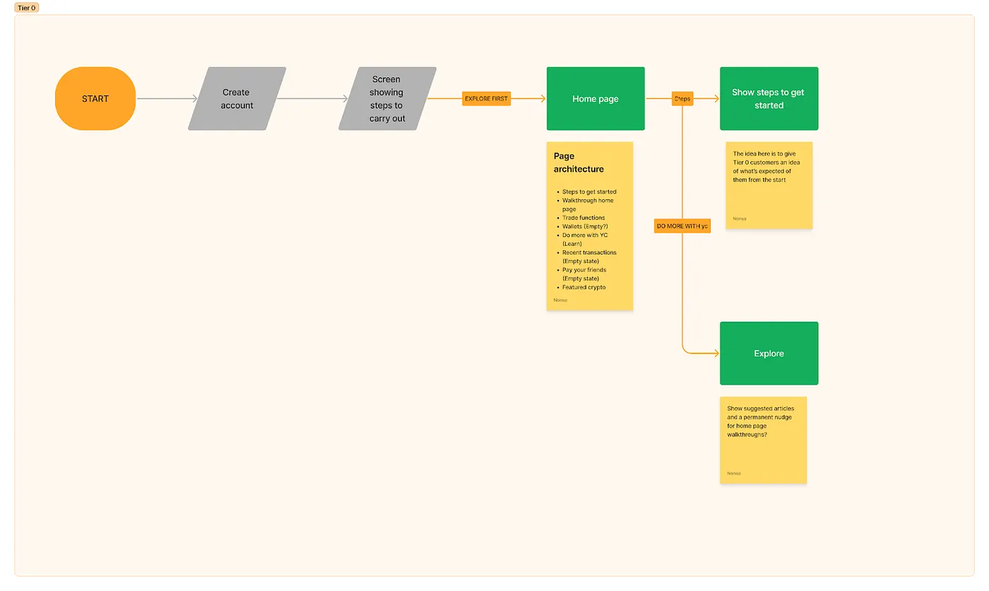
We mapped the first-time journey for what we called Tier 0 customers: brand new, never traded, probably intimidated. The map gave the home page two exits, Steps and Explore first, and a page architecture that led with steps to get started. One sticky note on it asked the question the whole project turned on: should we show suggested articles and a permanent nudge on the home page?
A permanent nudge is the dangerous answer. The home screen of a money app is the most valuable surface the company owns, and every team wants a card on it. Say yes once and it becomes a feed of things the company would like you to do. So the answer came with a condition, and the condition became the product.
Guidance can live on the home screen only if it is earned by the customer’s state, never scheduled by ours.
three ways to say it, and what each one costs
Guidance on the home screen can be a gate, a fixture, or a function of the customer. We built the first two far enough to feel their cost before the third became the rule. Each one solves the problem; they differ in what they charge the customer for the help.
Try the same task in all three: you want to buy, and you have not deposited yet. Watch what stands between you and the Buy button, and what the card says after you finally deposit.
the gate
the steps as a full-screen sheet on every launch until they are done. Start opens the deposit. No close, no explore-first.
- optimises
- visibility. every customer sees the guidance, every time, and cannot miss the first step.
- costs
- the home screen. a customer who came to check a balance or buy has to deposit, or leave. guidance becomes a toll.
guidance should not become a toll gate.
the fixed card
one card, the deposit ask with Step 1 of 4, at the top of the home screen for everyone, always.
- optimises
- calm. nothing blocks the screen, the layout never moves, and the ask is one tap away.
- costs
- relevance. after the deposit the card still asks for a deposit. by the third launch it is furniture, and by the fifth it is noise the customer has learned to scroll past.
repeated guidance has to earn its space.
the state machine
the same slot, but what it says is a function of what the account has done: new, back without a deposit, active.
- optimises
- relevance without interruption. one sentence, in the customer's language for where they are.
- costs
- complexity that has to be right. three vocabularies, an order of next moves, and a reason for every change, or the card reads as random.
guidance can live on the home screen only if it is earned by the customer's state.
the card is not a banner. it is a small state machine.
The top of the white sheet became a slot: a heading, an optional label on the right, and one card. Everything below it, the actions, the wallets, the tab bar, stays the same for everyone. The slot is the only thing that reads the customer, and it reads the ledger, not a marketing calendar.
A banner is content someone chose to show you. This is different: the sentence at the top is a function of what the account has and has not done. Three inputs, three outputs, and a set of things it is not allowed to do. Someone who signed up yesterday and someone who traded once in March should not see the same card, and neither should be able to tell it was ever anyone else’s.
the machine
open the state tablethree customers, what the slot says to each
| signed up | back, still no deposit | active | |
|---|---|---|---|
| customer state | created an account in the last few days. no deposit, no trade. | has opened the app more than once and left without depositing. | has deposited, and usually traded at least once. |
| what the system knows | sign-up date, no deposit on record, first sessions after onboarding. | no deposit, and the deposit ask has already been shown and not acted on. | money in a wallet, a trade on record, an unverified email, articles not yet read. |
| what the card has to do | name the one move that unblocks everything and make the path feel finite. | repeat the ask without escalating it, and offer a reason to trust it. | offer a next move as a choice, and put learning where it ends in a trade. |
| what it must not do | explain crypto, list every step, or block the screen. | count steps at someone who has already ignored them, or add a second card. | talk to a customer like a sign-up, or hide the rest of the moves. |
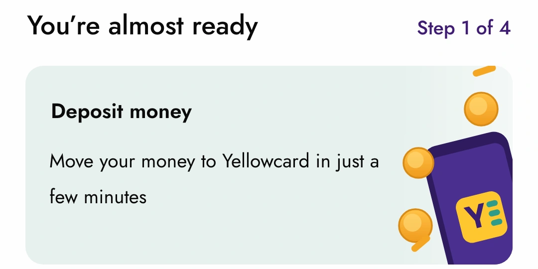
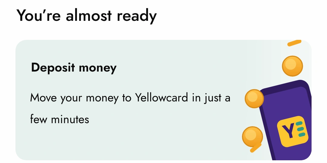
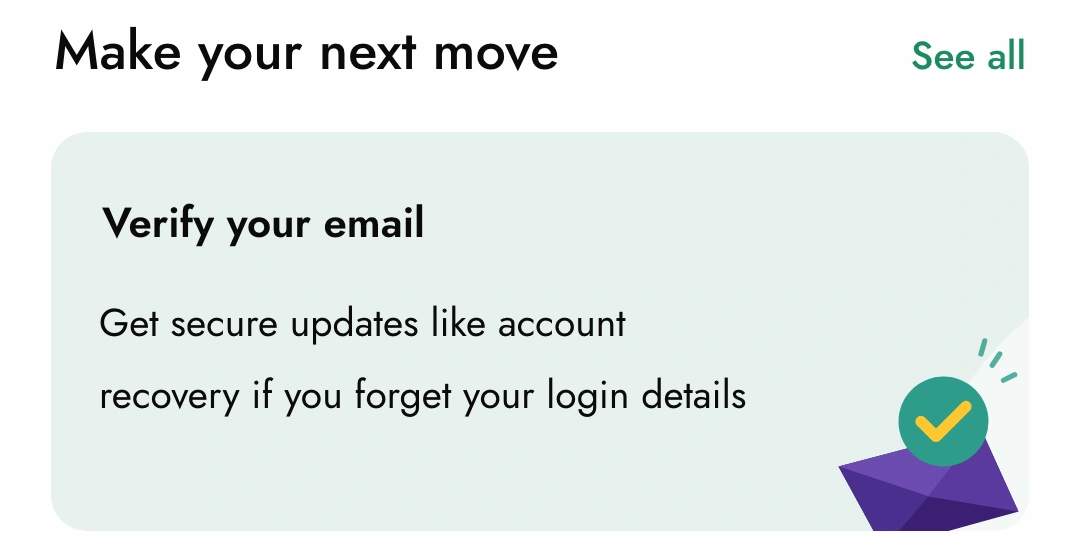
| what it shows | You’re almost ready · Step 1 of 4 Deposit money below the wallets: Do more with Yellowcard (marketing tile) | You’re almost ready Deposit money below the wallets: Knowledge base | Make your next move · See all Verify your email below the wallets: Quick insights |
the rules
open the rulesif, then, because
the customer has never deposited
thenthe card asks for a deposit, under You’re almost ready
becausenothing else in the product is possible without money in a wallet. The first move is always the same one.
it is one of their first sessions after sign-up
thenthe heading carries Step 1 of 4
becausea count makes the path finite. Four is short enough to believe.
they have come back without depositing
thenthe count is dropped and the tile below the wallets becomes the knowledge base
becausethe ask has already failed once. Repeating it is fine; escalating it is nagging. What might help is a reason.
they have deposited
thenthe vocabulary changes to Make your next move with See all
becausethey are a customer now. A customer chooses; a sign-up is guided.
more than one thing is outstanding
thenthe slot still shows one card, the one that unblocks the most
becausetwo cards is a feed. The rest wait behind See all.
the preview card is dismissed
thenit stays dismissed
becausea nudge that comes back after you close it is a notification, and there were enough of those.
the walkthrough is opened
thenit ends back on the home screen
becauseit is a preview, not a destination. Thirty seconds, then the real thing.
an article is opened
thenit starts with a disclaimer and ends in Trade crypto
becauseeducation without a door back to the product is a blog.
the customer wants none of it
thenLet’s explore first is always there
becauseguidance is never a gate. If the nudge ever blocks the screen it stops being one.
the customer has done everything
thenthe slot keeps Make your next move and offers Learn as you go: quick insights, when they want them
becausean empty slot would move the layout, and there is always something worth knowing.
edge cases
- deposited but never verified email
- the active card asks for verification, not a trade. Recovery is the more expensive thing to be missing.
- dismissed the preview, then reinstalled
- dismissal was stored with the account, not the device, so it stays gone.
- deposit pending, not yet cleared
- the slot still reads as no deposit until the ledger says otherwise; the card cannot promise a state the money has not reached.
- all four steps done, nothing outstanding
- the slot does not collapse. It keeps the next-move vocabulary and offers quick insights.
first launch: the steps, and a way out
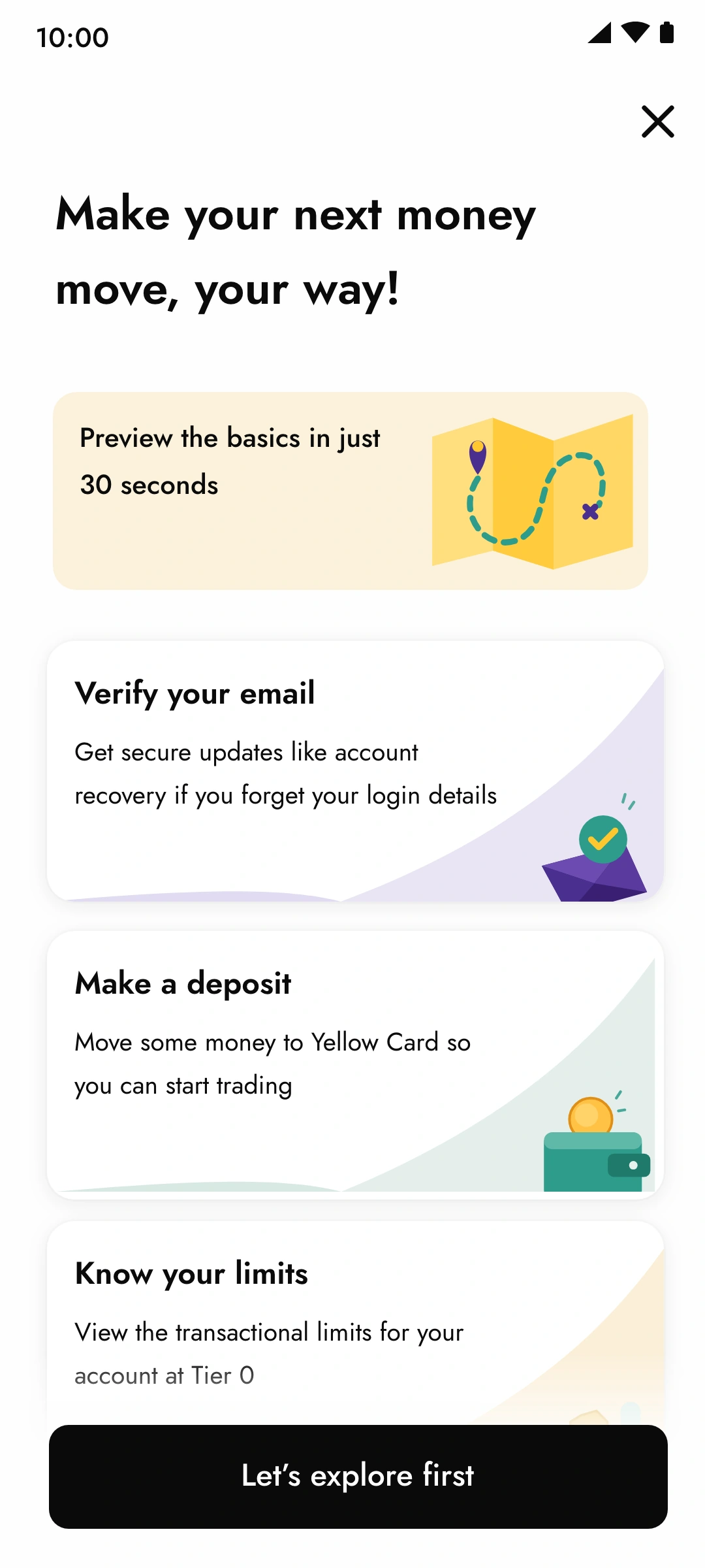
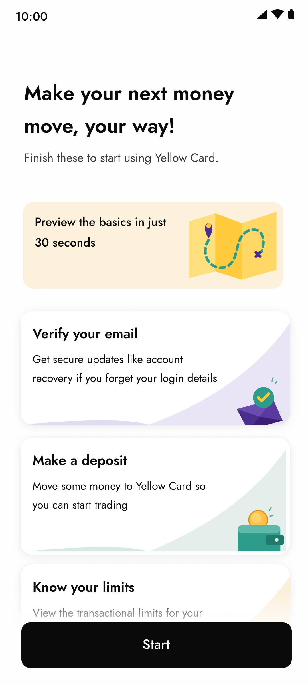
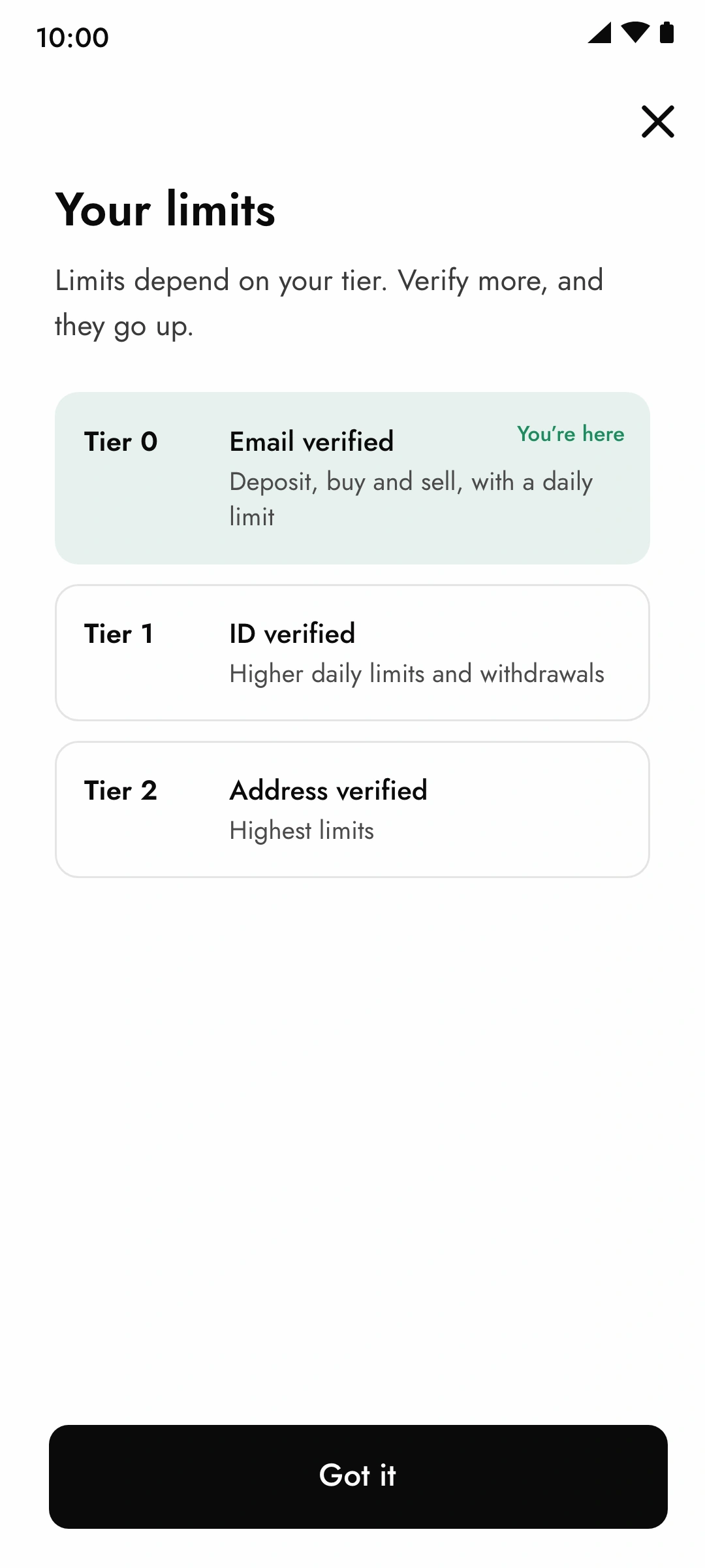
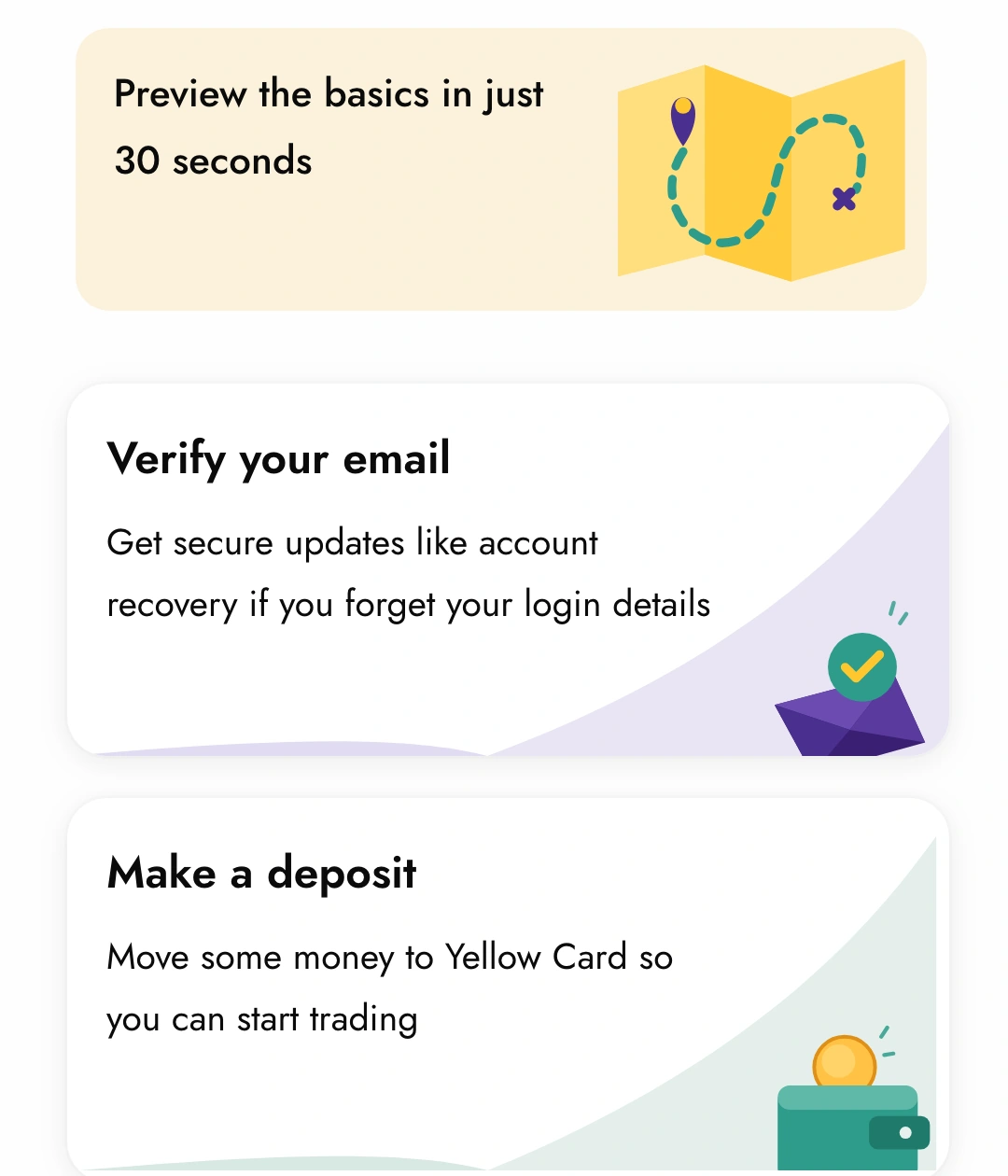
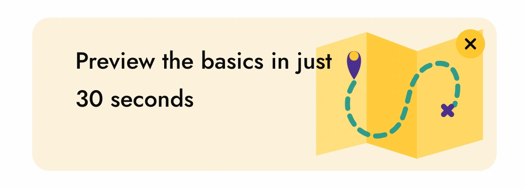
The state machine has a problem on day one: a brand-new account has no history to read. So the first launch is the one time the steps are shown all at once, as a sheet, before the home screen. Make your next money move, your way! lists them as cards: verify your email, make a deposit, know your limits. The first card is different. Preview the basics in just 30 seconds opens a walkthrough of the home screen, for the customer who wants to look before they do anything.
In the first build the sheet ended in a start button, and people looked for a way past it before they read it. The button became Let’s explore first. Every path through the steps has an exit to the ordinary product, and the home screen picks the thread up with Step 1 of 4 when they get there.
The nudge is a suggestion the customer can leave. If it ever blocks the screen, it stops being one.
what people misread, and what changed
Most of the iteration went into language, and most of the language problems were the same problem: a card that reads as one thing to the team and another to the customer. We watched for it in three rounds of copy review with the product manager and the content writer, and two weeks of the team using the beta build on their own accounts before rollout. No moderated study; the survey was the only external research.
Each row is a misreading, what it told us about the system, and the change that followed.
open the observationswhat we saw, what it meant, what changed
| what we saw | what it meant | what changed | where |
|---|---|---|---|
| the step list on first launch read as mandatory. In the first build people looked for a way past it before reading it. | a list of steps with a single Start button is a gate, however friendly the copy. | the sheet’s button became Let’s explore first. The steps carry on as Step 1 of 4 on the home screen instead of standing in front of it. | first-launch sheet · home, signed up |
| on the second and third open, Step 1 of 4 stopped reading as help and started reading as a reminder that nothing had been done. | a count is motivating once and accusatory after that. | the count shows only on the first exposures. A customer who returns without depositing sees the same ask without the count, and the knowledge base below it. | home, back without a deposit |
| a customer who had already deposited saw You’re almost ready and read it as the app forgetting them. | the vocabulary of the unactivated cannot be reused for people who have activated. Stage is a sentence, not a badge. | a second vocabulary: Make your next move, and See all where the count used to be, because now the customer chooses. | home, active |
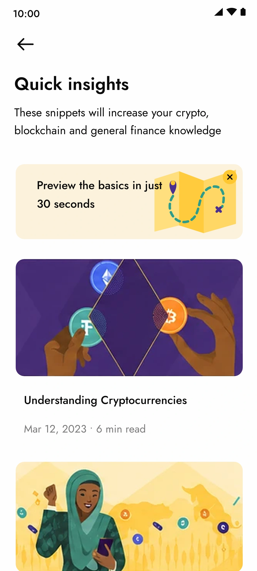
| the preview card in quick insights was taken for the first article and tapped as if it were one. | in a list of articles, anything card-shaped is an article. | the preview card got its own illustration, a duration (in just 30 seconds) instead of a read time, and an × so it can be removed for good. | quick insights |
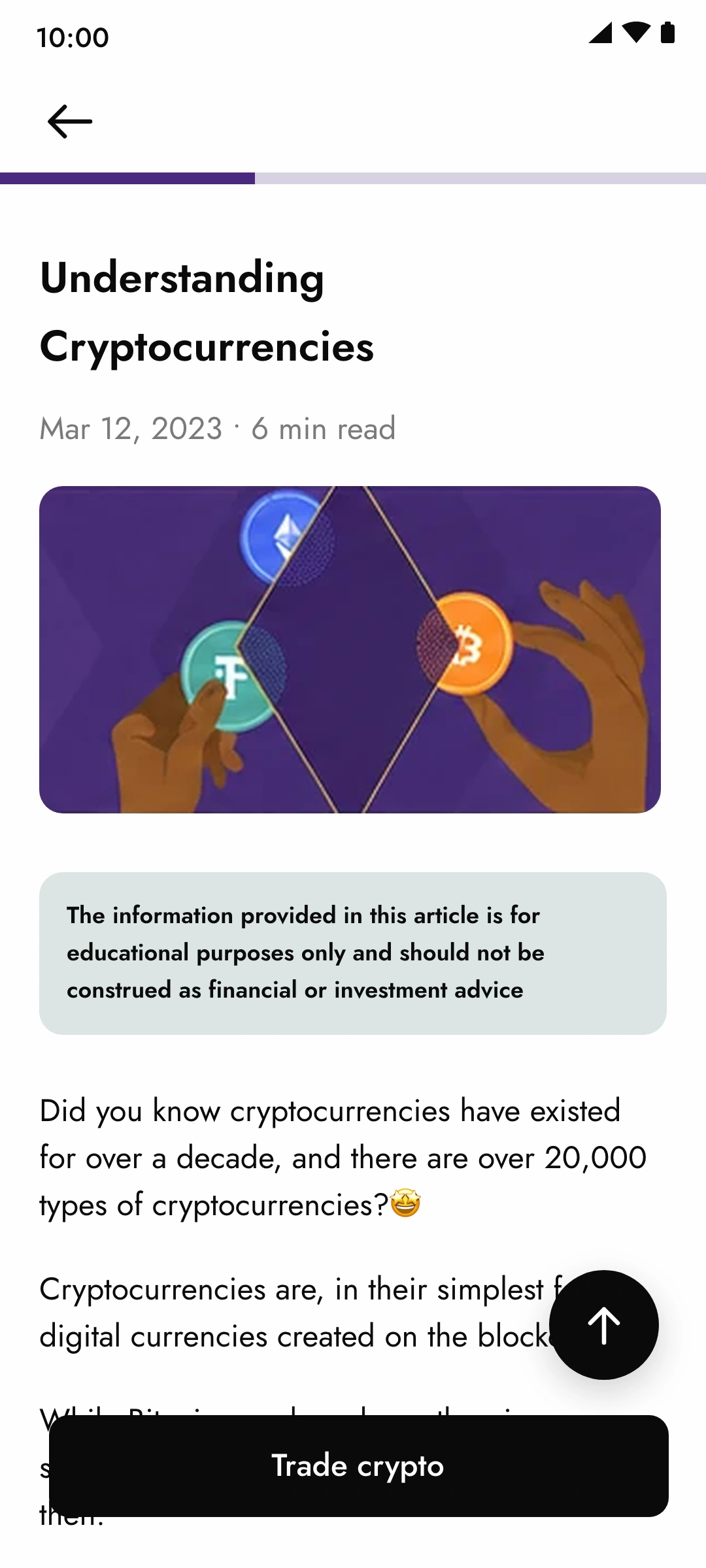
| article drafts read as recommendations. The compliance review flagged two of them. | in a regulated product, education and advice are one adjective apart. | every article opens with the disclaimer and closes with Trade crypto, so the reader is told what it is and given a door back to the product. | article |
| early card copy explained how a deposit works. It read as instructions, and nobody read it. | the card has room for one line of what and one line of why. The how belongs in the flow it opens. | Deposit money · Move your money to Yellowcard in just a few minutes. Almost every card went through the same cut. | every card |
education in context, and a way to say no
The survey said people wanted to learn, and the active state has a customer who can act on what they learn. So its See all leads to Quick insights: short articles, six to eight minutes, each opening with a disclaimer that it is education and not advice, and each ending in a trade action. The article is not the destination. It is the longest route we allow between not knowing and doing.
The preview card lives here too, and here it has an ×. A customer who has seen the basics, or never wanted them, can dismiss it and it stays dismissed. The list closes the gap and the articles move up. This is the same rule as the home screen, one level down: education is offered, and the offer can be refused without a trace.
what we measured, and what moved
We did not measure whether people liked the nudge. We measured whether they did the thing it asked. Three conversions, each tied to one stage of the machine: did a signed-up customer deposit, did a deposited customer buy, did an unverified customer finish KYC.
Window and cohort: the first eight weeks after release, among customers who had been inactive for at least thirty days before it. The comparison is the same cohort’s behaviour in the eight weeks before release. There was no holdout group.
how it was measured, and what it does not prove
- measured
- of previously inactive customers who had signed up and never deposited, the share who made a first deposit in the window.
- against
- the same cohort’s first-deposit rate in the eight weeks before release, which was low enough that the team had stopped reporting it.
- why it mattered
- a deposit is the gate to everything else in the product. It is the first thing the card asks for, and it is an action, not a tap.
- does not prove
- that the card caused it on its own. KYC changes and a marketing push shipped in the same window, and nothing says whether the people who deposited once deposited again.
how it was measured, and what it does not prove
- measured
- of previously inactive customers who had deposited and never traded, the share who made a first buy in the window.
- against
- the same cohort before release.
- why it mattered
- the trade is where the product earns, and where the survey said people froze.
- does not prove
- much about the nudge specifically. People with money already in a wallet are the most committed group in the funnel, so part of this number is selection. It says nothing about trade size or a second trade.
how it was measured, and what it does not prove
- measured
- the share of customers with verification outstanding who completed it in the window.
- against
- roughly fifteen percent before: at the time of the survey, 85% of customers had not finished KYC.
- why it mattered
- verification is the ceiling on what a customer can deposit and withdraw. Without it, the other two numbers cannot grow.
- does not prove
- that the nudge did this alone. The verify-email card is one prompt among several the compliance team added that quarter, and completing KYC is not the same as trading.
what kind of number each one is
open the definitions
- engagement
- taps on the card, opens of See all, articles read. We logged them and did not report them; a tap proves nothing.
- adoption
- first deposit, first buy, KYC done. The three numbers above. One-off behaviours the product needed and the customer had been avoiding.
- usage
- a second deposit, a fifth trade, a month later. Not measured in this window.
- behaviour change
- whether a customer who learned something did something different with money. Only the adoption numbers approach this.
- commercial outcome
- volume, revenue, retention. Not claimed here.
These were customers who had been sitting in the product for months. The movement is real. What the numbers cannot do is separate the card from everything else that shipped around it, or say which of the three sentences did the work.
They also say nothing about whether it held. A card that gets a first deposit out of someone is not the same as a product that keeps them trading, and the second question was outside what we tracked.
what this changed, and what would change it back
The assumption that changed. I went in assuming inactive customers were a marketing problem: bring them back with a campaign. They were already back, on the home screen, and leaving because it did not tell them what to do. Activation is a design problem before it is a marketing one.
What it taught me about guidance in a money product. guidance inside a financial product has to be earned by state, not scheduled by a calendar. The moment the card says something the ledger does not support, it becomes advertising, and the customer treats everything after it as advertising too.
Not the same outcome. engaging with education and making better financial decisions are different outcomes. We could see people open articles. We never saw whether they traded more carefully, or less, afterwards.
What I would measure earlier. the three conversion baselines and a holdout, before the first card shipped. And one join we never made: whether reading an article changed what a customer did next with money.
What is still unclear. whether the effect held. A card that gets a first deposit out of someone is not a product that keeps them trading. And whether the second vocabulary, Make your next move, ever worked as well as the first.
what would make me take the card down
open the list
- if dismiss rates on the preview card were high in the first session, the walkthrough is in the wrong place, not just the wrong card.
- if active customers ignored Make your next move at the rate new customers acted on Step 1 of 4, the slot works as guidance and not as a suggestion, and the third state should be something else, or nothing.
- if a holdout showed the same deposit lift without the card, the slot is decoration and the space belongs to the wallets.
- if article readers traded worse than non-readers, the education is doing harm, and the disclaimer is not a defence.
the slot is a hypothesis about where guidance belongs, not a rule about home screens. any of these would send me back to the effort/value board.
try it
Be the customer. Watch the screen.
Start on the first-launch sheet, explore first, deposit, and the home screen moves on. Verify your email, learn your limits, open See all, dismiss the preview, read an article. Then relaunch: the app remembers what you did, and what you closed stays closed.
things worth trying, in order
Things worth doing, in order:
- Let’s explore first, then look at the top of the screen
- tap Deposit money
- See all → × on the preview card
- open Understanding Cryptocurrencies, scroll, come back
- buy something, withdraw more than you have, come back
- use the buttons below to be each customer, then Relaunch to see what the app remembers