Lomanized

The first Lomanized moved beautifully and said almost nothing. The second says exactly who Loma is, and moves less. The work is in the distance between those two.
What was there. Lomanized: Emmanuel Loma, a lifestyle, portrait and street photographer, born in South Sudan, who found a camera at nine and has not put it down. A friend I consider a brother. I have designed and built his site twice: once in 2022, one of my first independent projects, and again for 2025. Same person, same pictures, two different ideas of what a portfolio is for.
What changed. The first version was a beautiful machine I had borrowed: a collage that drifts with the cursor, colour fields, a menu that rotates on its own. The second is an identity: near-black, one red, film grain, a condensed face that shouts his name and a handwriting face that whispers, and every page a chapter of his story.
Why it matters. A photographer’s site can be an engine or a voice. The first version was an engine I borrowed; the second is a voice we built. What changed between them is what I think a portfolio is for, and what I would do next is give the voice back the engine’s fluency.
What it looks like. Both sites still run, and the same moments in each sit side by side below. Further down you can scrub through them.
- client
- Lomanized: Emmanuel Loma, a lifestyle, portrait and street photographer, born in South Sudan, who found a camera at nine and has not put it down. A friend I consider a brother.
- role
- designer and builder, both times. Art direction, typography, structure, image sequencing, copy, and the front-end: hand-edited HTML in 2022; Webflow plus hand-written GSAP and Lenis in 2025.
- 2022
- built through the autumn of 2022 and finished the following spring: the site, a rate card, an about page, a prints link, then one last pass across every page. assembled by hand from two saved sites: a developer-built Squarespace portfolio for the home, category and about pages, and a Webflow template for the project pages. I replaced the photographs, the names and the copy, and edited the HTML directly.
- 2025
- designed in Webflow through 2024, published as the 2025 portfolio, then exported and extended by hand: the portraits page’s carousels and reveals are hand-written GSAP and Lenis, not Webflow.
- status
- the 2025 site is live as Loma’s portfolio. The parts I would change again are listed at the end, not hidden.
- evidence
- two working sites and their source. no analytics; the argument is made by running the two next to each other.
the first version: an engine I borrowed
In 2022 I believed a portfolio had to move. So the site moves before you touch it. The intro is a spread of pictures with his name printed across them, and the whole spread drifts toward the cursor. Below it, a full-screen colour field per category, blue for portraits, yellow for architecture, teal for fashion, each named in type larger than any photograph. The index is a skewed list that rotates on its own and outlines the word under your pointer.
None of that motion was mine. I took two sites whose structure I admired, a developer-built Squarespace portfolio and a Webflow template, saved them, and rebuilt them around Loma’s photographs by editing the HTML by hand. static HTML · jQuery · GSAP + ScrollTrigger · a saved Squarespace bundle for the cursor parallax, the lightbox and the rotating index · lazysizes · Poppins and Helvetica. Eleven pages.
It was fluent because someone else had spent a year making it fluent. It would have looked the same around any photographer.
what it got right, and what survived
The redesign is not a rejection. Four ideas from 2022 are load-bearing in 2025; they were carrying the wrong face and too much borrowed decoration to be seen. Each row is the idea, how it looked then, how it looks now, and why it stayed.
| the idea | 2022 | 2025 | why it stayed |
|---|---|---|---|
| an entrance | the intro collage: his name across a spread of pictures that drift with the cursor | WELCOME TO LOMANIZED, the letters filling the screen and his portrait behind them | a photographer’s site gets one first impression. Both versions spend it on the name. |
| a flat site | every category, the rate card, prints and bookings in one rotating index | four words in the nav, three sets in a row on the home, and a footer link to prints | nothing should be more than one step from anything. That rule survived, with fewer things to reach. |
| type at the size of a picture | PORTRAITS set larger than any photograph, in Helvetica, on a blue field | 1999 set larger than the boy in the photograph, in Gazzetta, on black | the idea was right in 2022. The face was wrong. It read as a template; it had to read as him. |
| a way to buy | RATE CARD 03 and BUY PRINTS 04 in the index | a prints page, one paragraph and one button, printed and shipped through Pixieset | the site is also how he earns, and both versions keep that one step away. |
where it started fighting the work
The limits showed up in use. Loma sent the link to people and people opened it on phones. A category that was a blue field with a word and drifting pictures on a laptop was a blue field with a word on a phone, because the pictures only appeared where a cursor moved. The project pages, from the other template, were white, set in a different face, and said Home where every other page said BACK.
None of these were bugs. They were the structure doing exactly what it was designed to do for a different photographer with a different amount of work. Each one is below, with what it revealed and what rule it became.
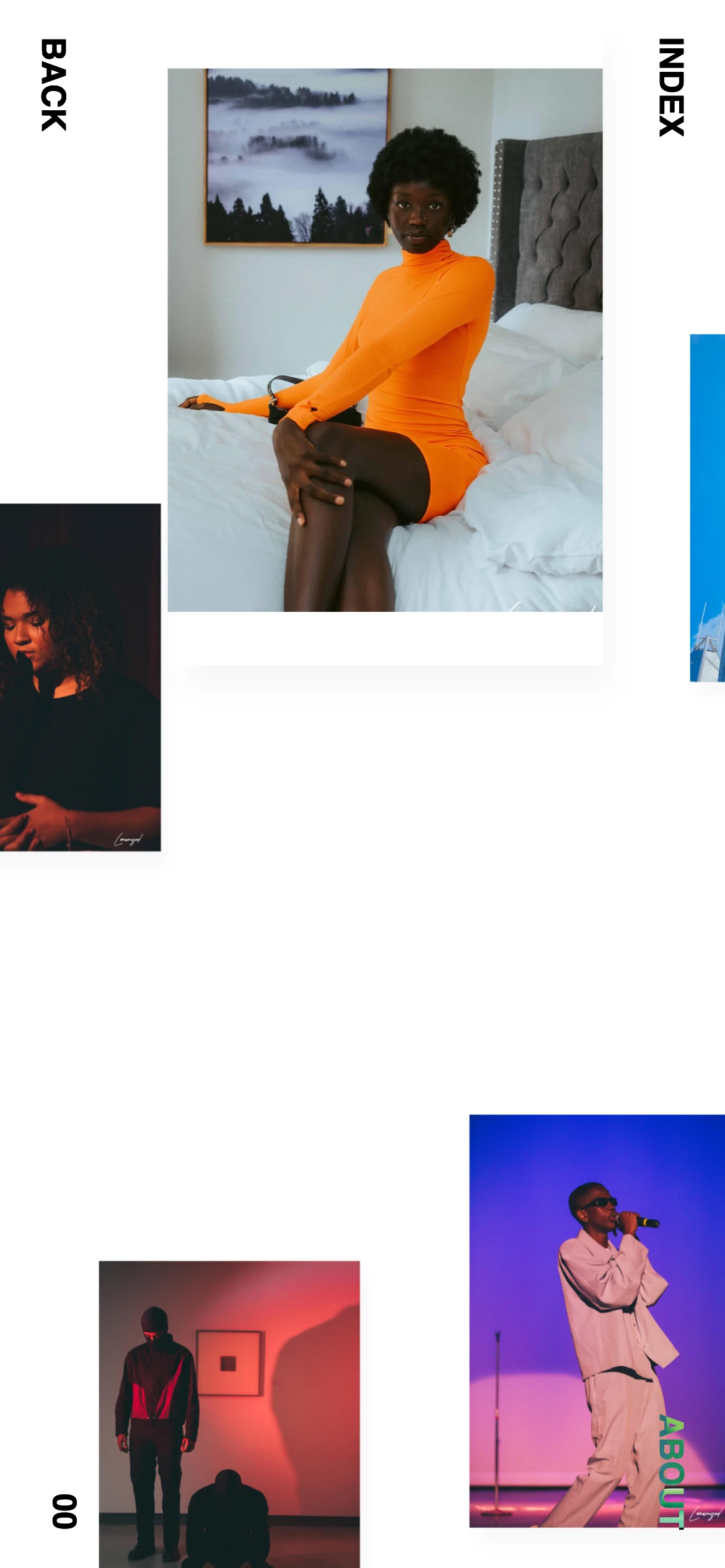
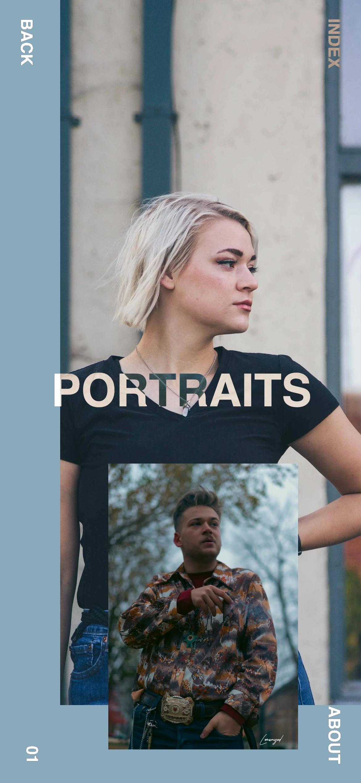
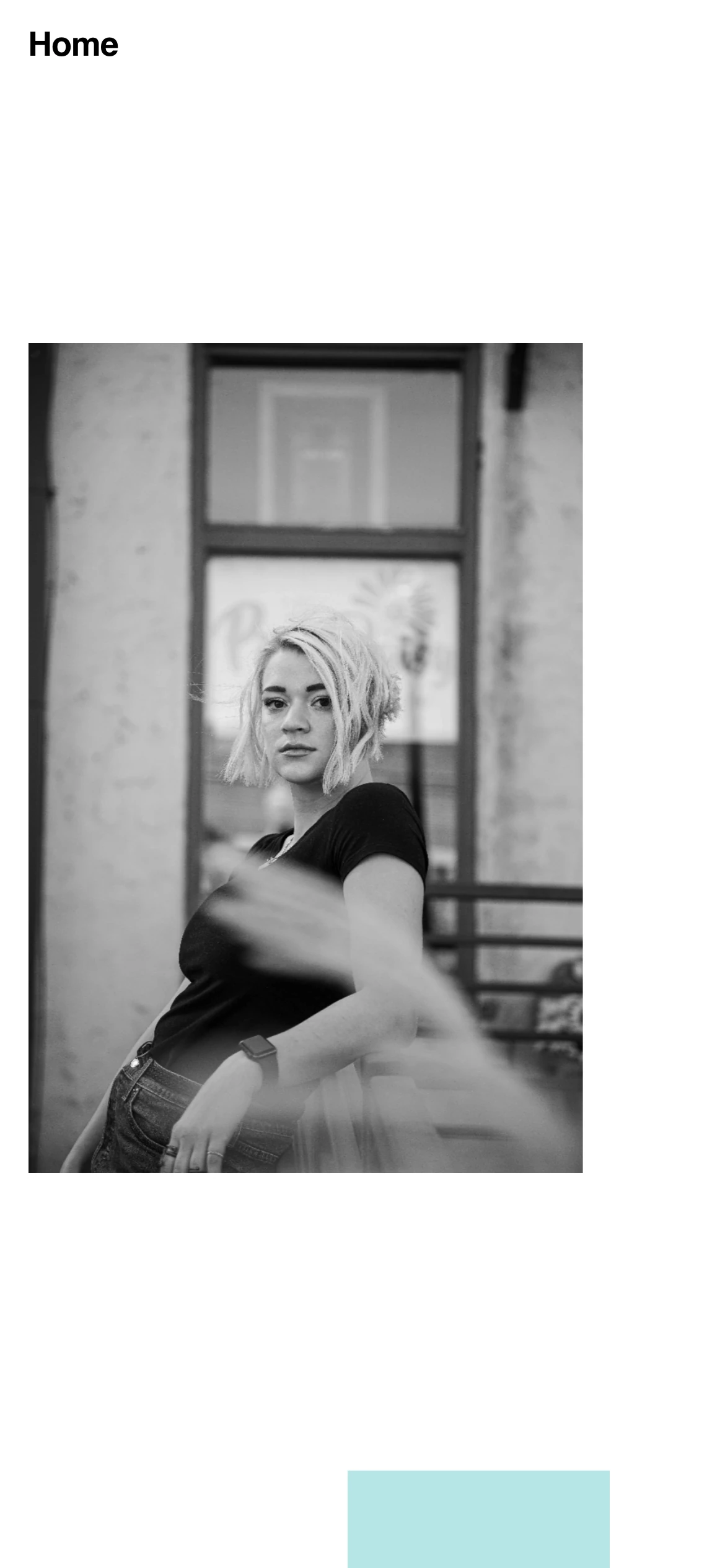
| what showed | what it revealed | what it became |
|---|---|---|
| the intro collage and the cursor parallax were the best things on the site, and they were not mine. I had saved a developer’s Squarespace site and rebuilt it around Loma’s pictures. | the motion was fluent because someone else had spent a year on it. It was also generic: it would have looked the same around any photographer. | identity before mechanics. In 2025 the palette, the type and the voice were fixed before a single interaction was designed. |
| each category was a colour field with its name in 120px Helvetica. Blue for portraits, yellow for architecture, teal for fashion. Nothing about the colours or the face belonged to Loma. | a system that expressive has to be about the person, or it is about the template. | one ground, one red, one yellow, one condensed face. The same loudness, now his. |
| the pictures on a category page appeared where the cursor moved. On a phone there is no cursor, so a category page was a blue rectangle with a word on it. | a reveal that depends on a pointer is not a reveal on the device the link is opened on. | every reveal is driven by scroll, and the phone layout was designed on its own terms: the name first, then the welcome, then the sets as cards. |
| the home, category and about pages came from one saved site; the project pages from a different template. Different type, different white, Home instead of BACK. | two skeletons cannot be dressed as one body. The seams showed on every project page. | one structure for every page: wordmark, four links, a title, the work, a footer. |
| the index listed eight categories, a rate card, prints and bookings. Several categories held two or three pictures. | breadth was standing in for a point of view. The menu promised a studio; the pages showed a person. | three sets, portraits, urbanscape and couples, each deep enough to carousel through, plus videos. |
| the source still carried the saved site’s project names, and the photographer’s name was spelled two ways on two pages. | when you borrow a structure you inherit its content, and it takes more than a find-and-replace to make it yours. | content first: the about page was written before the home was laid out. 1999, age nine, South Sudan, the camera. |
the rules that changed
The brief did not change and Loma did not change. What changed was the order of decisions. In 2022 the structure came first and the identity was whatever was left. In 2025 the identity came first, a palette, two typefaces, a first sentence, and every mechanic had to earn its place under it.
The rules were argued against a site that already existed and that the client liked. Each one is written with its reason, because a rule without a reason is taste, and taste does not survive a client meeting.
identity before mechanics
the 2022 site had motion before it had a voice. The 2025 site had a palette, two typefaces and a first sentence before it had a single interaction.
one ground, one red, one yellow
colour on the page competes with colour in the picture. Red is for words, yellow is for handwriting, and the pictures keep their own colour.
type is allowed to be as big as a picture, if it is his
1999 and WELCOME TO LOMANIZED are not decoration. They are the story, and they are set in a face nobody else on the internet is using.
every reveal is a scroll
the link is opened on a phone. Anything a cursor reveals is invisible there; anything a scroll reveals is not.
every page is a chapter
arrive, welcome, the sets, the story of the boy with the camera, then prints. A visitor reads the site; they do not browse it.
three sets, deep, not eight categories, thin
the carousel is the proof: a set has to be worth going through, not just worth naming.
the phone gets its own composition
LOMANIZED first, then WELCOME TO, then the sets as cards with his handwriting on them. Not the desktop, narrower.
the second version: a voice
The 2025 site is built as an identity first: near-black, one red, one yellow, film grain, and two typefaces that are Loma’s and nobody else’s, Gazzetta for the shouting and BonVivant for the handwriting. Then the pages were written as chapters. You arrive on LOMANIZED in red across the whole screen, his portrait behind the letters. Scroll and WELCOME TO drops in from above; scroll again and my PORTFOLIO arrives in yellow, the my in his handwriting. Scroll back and it all reverses, because the title is not an animation, it is a position.
Below the title, the sets. Each opens from a sliver as it enters the screen, with PORTRAITS or URBANSCAPE or COUPLES set over the picture in the same red. A set is a carousel you click through. The about page is the story: 1999, the boy in the photograph, his name, the age he found a camera, then the biography. Webflow export · Webflow interactions for the scroll and hover reveals · hand-written GSAP + ScrollTrigger + Lenis on the portraits page · Gazzetta Variable · BonVivant · Halden Solid · Open Sans.
what the first version still does better
If the story ended with the second version winning every dimension it would be a redesign story, and it is not one. Three things the 2022 site does better.
They are the reason the reflection at the end is not “we fixed it”. The next version has to carry these forward inside the 2025 voice, or it is a step sideways.
- fluency
- the 2022 collage answers the cursor before you have decided to do anything. The 2025 hero waits for a scroll. The old site felt alive at rest; the new one is alive on demand.
- continuity
- in 2022 the pictures on a category page drift as you move, and the page scrolls through them without a cut. In 2025 a set is a carousel: next, next, a dot for each picture. Honest, but stepped.
- the index as theatre
- the rotating menu was the most memorable thing on the old site. Nothing on the new site is as much fun to open. The new nav is four words, which is right, and slightly dull.
the same moment, both versions
Pick a moment. Scrub both.
Four moments every visitor has: arriving, finding the work, looking at a set, and doing all of it on a phone. Each pair is the two sites at the same moment, given the same input, on one scrubber: what you are comparing is the decision, not the framing.
Worth watching for:
- what moves before you do anything
- what the largest thing on the screen is, and whose it is
- whether the motion is continuous or stepped
- on the phone: whether the pictures are there at all
arriving: the 2022 home moves toward the cursor before you scroll; the 2025 home holds his name still until you do.
how it is built, where it shows
Most of the engineering is invisible and should be. Four decisions are not, because they shape what a visitor sees: the two borrowed engines under the first site; and under the second, the title that is a scroll position, the portraits page written by hand, and the grain.
- 2022 · borrowed engines
- the home and category pages run a saved Squarespace bundle: cursor parallax, a lightbox, the rotating index. The project pages run a Webflow template’s scripts. Neither knows about the other, so every page loads cold and the type changes between them.
- 2025 · reveals as scroll progress
- the hero is a 3600px sticky section: WELCOME TO, then my PORTFOLIO, are Webflow scroll-progress interactions, so the title reveals at the speed you scroll and reverses when you scroll back. The set images open from a 29px sliver the same way.
- 2025 · the portraits page, by hand
- twelve carousels, each a set, with GSAP ScrollTrigger fading the next set in and Lenis smoothing the scroll. This is the part of the site that is code rather than Webflow, and it is where the next version starts.
- 2025 · grain
- a film-grain overlay sits over every page, a looping gif at low opacity. It is what makes the black feel like paper rather than a screen, and it is the first thing a performance audit would tell me to remove.
what I would change again
What changed in my thinking. I used to think the job was to make the site move well. The first version proves I could make a site move well by borrowing the movement. The second version proves the harder thing: that I could make a site sound like one person. Voice turned out to be the design decision; motion was a material.
Loud is not the opposite of restrained. the 2025 site is louder than the 2022 one, bigger type, harder colour, and it is more restrained, because everything loud on it is about Loma and nothing loud on it is about the template.
On borrowed structure. both versions stand on other people’s structure: a saved site in 2022, Webflow in 2025. The difference is that in 2022 the structure decided what the site was about, and in 2025 the identity was decided first and the structure was made to serve it.
What I could measure. there is no analytics story here. The test was the one I could run in a room: does the person next to me want to see the next picture, or do they say something about the site. In 2022 they said something about the site. In 2025 they say something about Loma.
still unfinished in the second version
- the hero portrait is a 447-pixel image shown at 900. It is soft on every screen larger than a phone.
- the carousels are stepped where the old collage was continuous. The next version should scroll through a set, not click through it.
- the videos page has a title and no videos. Either the films arrive or the page goes.
- the about copy carries an encoding error where its apostrophe should be.
- the grain overlay is a gif on top of every frame, and the site pays for it in scroll performance on older phones.
what would send me back toward the first
- if a third version can carry the 2022 fluency, the collage that answers the cursor, the pages that scroll through pictures without a cut, in the 2025 voice, then this whole evolution was a detour and the real site is the one that has both.
- if visitors on phones stop at the hero, the welcome is too long for a thumb, and the sets have to come before the second scroll.
- if Loma’s work moves toward film, the type-first site is the wrong frame, and the videos page becomes the home.
the evolution is not finished. the third version starts from the unfinished list and from the three things 2022 still does better, not from a blank page.